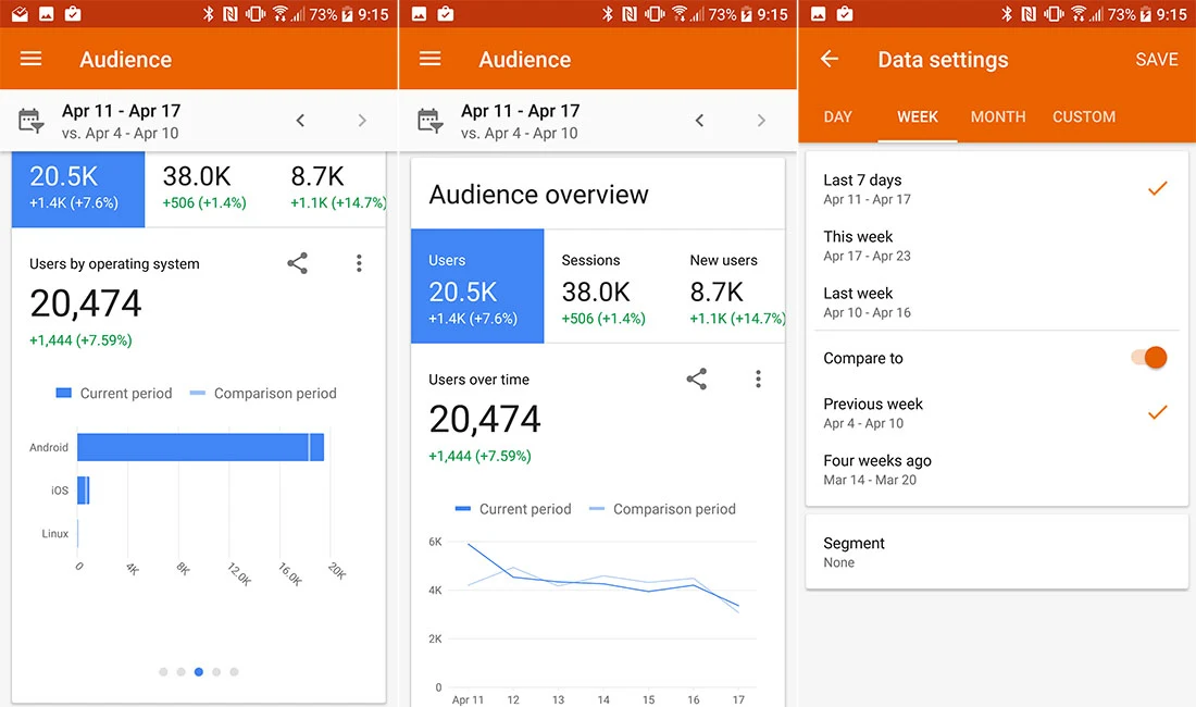
The update, overall, is much cleaner and less grey than the previous version. Google has added a quick stat sharing action to info screens as well. Yes, there is lots of white space, but the boxes with your data, like real-time traffic, overall sessions, users, etc., all take up less space for the most part.
With that said, Google has taken out all of the drop down lists from the slideout menu and tossed everything into swipe-able boxes in each category page and box. I don’t know if I love that idea yet, to be honest. I guess once I get used to it, it could be OK, but I’m so used to years of that slide out menu. We’ll see.
Here is new icon:
You can grab the update on Google Play or sideload it with the .apk below.
Play Link | Download APK (.apk)

![[APK] Google Analytics Updated To v.3.0 G With New UI, Icon and More Material Design [APK] Google Analytics Updated To v.3.0 G With New UI, Icon and More Material Design](https://blogger.googleusercontent.com/img/b/R29vZ2xl/AVvXsEjvzHgs7JwHvl8GsXagGUC8zkWJryCTNG3EY5GVHeF_wARc2-GOmu1CESbIQ1W1AE2GbEiIox_Zart2LA41SLKIkQrL6HHP0N_e9d0d5jYuQEh8DaGKY_2cMhmpIxyGVPRZNebtQMU8ibE1/s1600-rw/google-analytics2.jpg)


0 Comments